Photoshop Settings Used -Text -Text Transform (Skew and Warp) -Image Transform -Styles -Shapes
Design Thoughts:
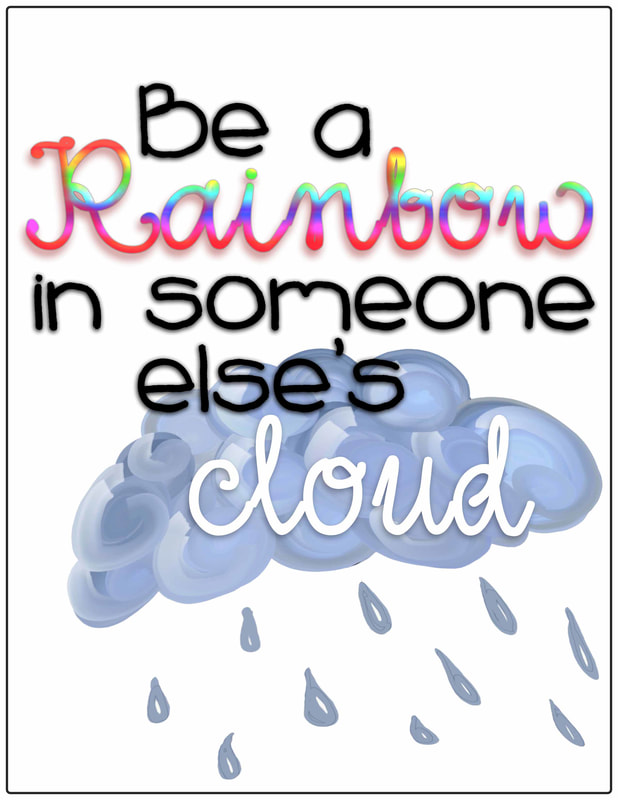
This design all started with a style. I created a horizontal rainbow style and added it to this inspirational design. I wanted this design to be something that teachers would want to display in their classroom. I used the rainbow style on the word "rainbow" and other styles, such as a drop shadow, on the other pieces of text.
Contrast: I chose to mainly use black text in this design so that the rainbow style of the word "rainbow" and the white style of the word "cloud" would contrast the rest of the design. Placing the gray cloud behind the word "cloud" also helps that word contrast more.
Repetition: The font used for "rainbow" and "cloud" is the same. The other text also repeats a font style. Another example of repetition is the drop shadow on all the text.
Alignment: I placed the word "Rainbow" just above the top rule of thirds line and aligned the rest of the design around that word. I also payed special attention to the alignment of the word "cloud." The "l" aligns in the center of the "s" and "e" in the word "else's."
Proximity: I used proximity when placing the different text elements in the design. All of the text is placed close together to show that the relationship of the message. I also considered proximity with the cloud image and the word "cloud."