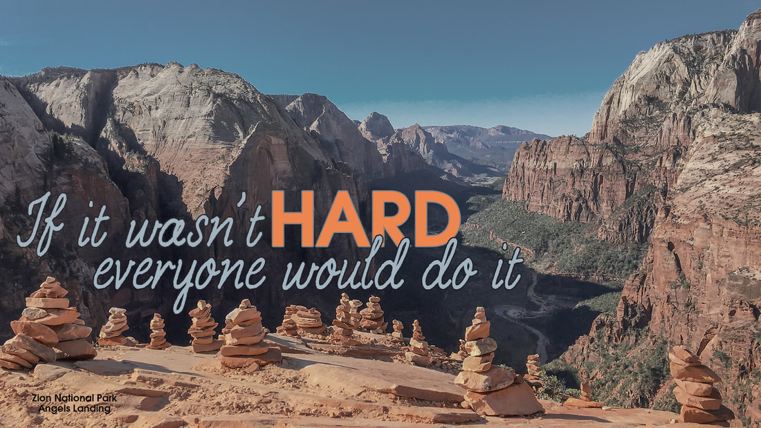
Original Photo- by Chaeli Bell
Camera Raw Settings Used:
- I first opened the photo in Camera Raw and adjusted the highlights and shadows.
- I then reduced noise by using the noise reduction tools.
- I then used hue and saturation to improve coloring in the red rock.
- I started out by cropping the image in order to bring the stacked rocks to the main focus of the image.
- I then used the gradient tool to add a black and white mask.
- After adding the mask I adjusted the feather to make the mask very subtle.
- Once the corrections were made, I added the text and matched the colors to colors from the rocks and sky.
- I used the character panel to set the tracking for the script characters closer together.
Design Thoughts:
Fonts
- I wanted the word "hard" to stand out above the rest of the text. I decided to stick with a simple sans-serif font for the word "hard" and a script styled font for the rest of the quote.
- The main focus of the image is the stacked rocks and I wanted the type to add to the focus, not take away. For this reason, I chose to add the type close to the stacked rocks leaving space on the right side of the image.
- I felt like the caption "Zion National Park Angels Landing" helped portray why the quote was chosen for the image.
- The bluish color of the script type and the orange color of the word "hard" contrast well with each other and with the background.
- Contrast: The greatest contrast in this design is the orange color in the word 'Hard'. The font of the word 'Hard' contrasts the surrounding font.
- Repetition: The colors used for the quote are repeated throughout the image. Each color was selected from the image using the eyedropper tool.
- Alignment: The quote is aligned so that the bottom line overlaps the word 'Hard'. The quote is also aligned using the rule of thirds.
- Proximity: The quote was placed close to the edge of Angels Landing so that the proximity would reiterate that only a few do hard things. Zion National Park: Angels Landing is an important aspect of this design, but it is not the focus. For this reason, it was placed in small and in the corner so that it would add and not take away from the message of the design.
Fonts
- PC Licorice
- https://copyfonts.com/fonts/pc-licorice.html
- Moderne
