Design Thoughts:
This logo is for a skin care business. The client gave me a rough sketch of what she envisioned her logo looking like. The sketch included a lotus flower at the bottom of an ellipse shape with the name of the business (Cyoa) in the middle and 'Vitamins for your skin towards the top. She also mentioned that she would like some sort of vine in place of the ellipse. The client wanted a purple color scheme. The design elements I utilized were color scheme/contrast, repetition, top down/lines, and alignment.
The second logo can easily be converted to any color the client desires.
Repetition: The main use of repetition is through the colors in the logo. I repeated the color of the lotus flower in the name of the company.
Top down/Lines: The message hierarchy takes your eyes to Cyoa. As your eyes move to the lotus flower the lines bring your eyes back to the top of the logo to the words 'Vitamins for your skin."
Alignment: The alignment of the lotus flower and the vines show that the two elements are connected. It looks as if the vines are growing out of the lotus flower. The words 'Vitamins for your skin' are aligned in a way that make them appear to be an extension of the vines. The name of the company is centered align inside of the vines.
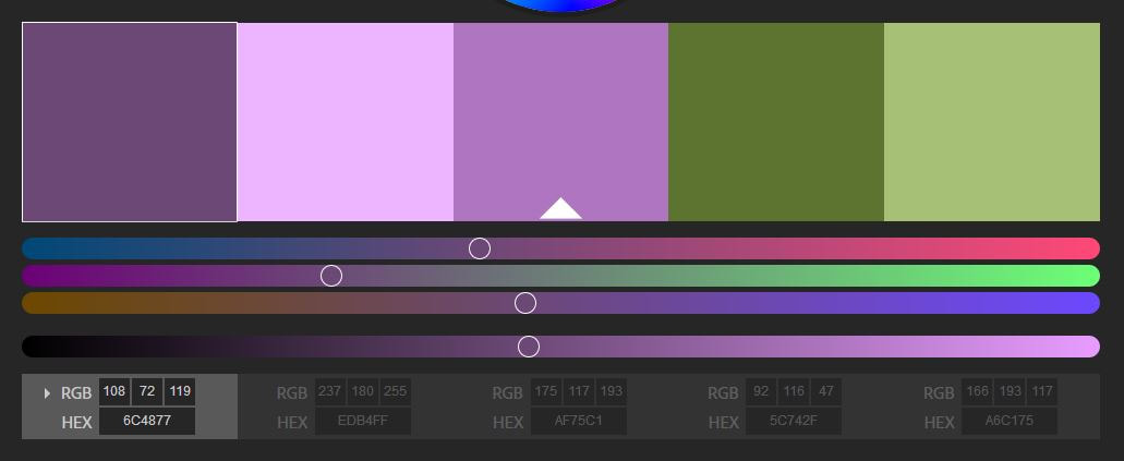
Color Scheme/Contrast: I chose to use contrasting purple and greens in the main logo design. I used Adobe's color website to create a contrasting color scheme. The name of the company is larger than the rest of the text, making it stand out.
This logo is for a skin care business. The client gave me a rough sketch of what she envisioned her logo looking like. The sketch included a lotus flower at the bottom of an ellipse shape with the name of the business (Cyoa) in the middle and 'Vitamins for your skin towards the top. She also mentioned that she would like some sort of vine in place of the ellipse. The client wanted a purple color scheme. The design elements I utilized were color scheme/contrast, repetition, top down/lines, and alignment.
The second logo can easily be converted to any color the client desires.
Repetition: The main use of repetition is through the colors in the logo. I repeated the color of the lotus flower in the name of the company.
Top down/Lines: The message hierarchy takes your eyes to Cyoa. As your eyes move to the lotus flower the lines bring your eyes back to the top of the logo to the words 'Vitamins for your skin."
Alignment: The alignment of the lotus flower and the vines show that the two elements are connected. It looks as if the vines are growing out of the lotus flower. The words 'Vitamins for your skin' are aligned in a way that make them appear to be an extension of the vines. The name of the company is centered align inside of the vines.
Color Scheme/Contrast: I chose to use contrasting purple and greens in the main logo design. I used Adobe's color website to create a contrasting color scheme. The name of the company is larger than the rest of the text, making it stand out.
Photoshop Settings Used
- I downloaded and uploaded new brush presets
- I used the transform tool to transform the different elements of the logo
- I used layer styles to make the name of the company pop out
- I warped the text at the top of the logo
Credits
Lotus Flowers:
-Created by Cathy Bell
Fonts:
-Aramis
-BauerBodni BT
Color Scheme:
-Adobe
Brush:
-Brusheezy
https://www.brusheezy.com/brushes/55070-free-swirly-floral-scrolls-brushes
Lotus Flowers:
-Created by Cathy Bell
Fonts:
-Aramis
-BauerBodni BT
Color Scheme:
-Adobe
Brush:
-Brusheezy
https://www.brusheezy.com/brushes/55070-free-swirly-floral-scrolls-brushes
