Design Thoughts:
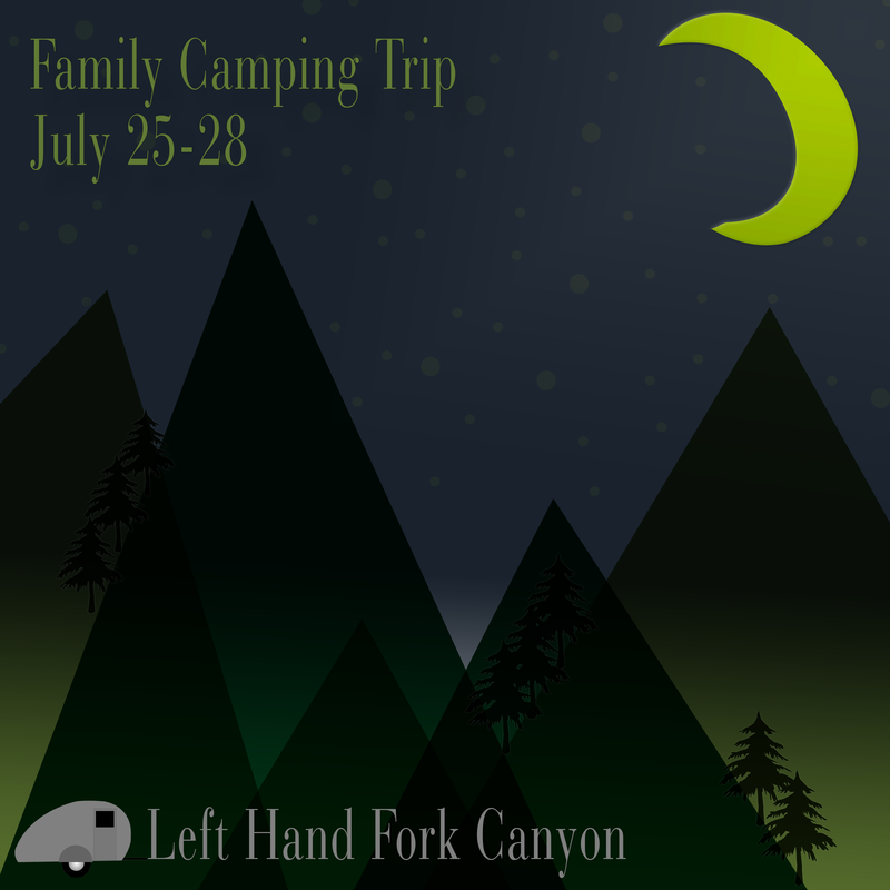
This design was created using the shape tool in Photoshop. I wanted to make a reminder about a yearly family camping trip. I used the shape tool to create woodsy look. I used a darker color scheme to give the viewer a night time feeling. I also used repetition, lines, alignment, and contrast. I wanted the design to be simple, yet pleasing to the eye.
Repetition: The main use of repetition is through the colors and the text font. I chose to only use one font throughout this design. The colors of the mountains are repeated throughout the design, as well.
Top down/Lines: The hard lines created by the mountains, naturally draw the eyes downward to the camp and 'Left Hand Fork Canyon.' Those same lines also draw the eyes back up to the date of the family camp out and the skyline.
Alignment: All of the text in this image is left aligned. The simple alignment helps keep the focus on the backdrop while allowing the viewer to quickly read the information.
Color Scheme: I chose to use monochromatic green color scheme for the mountains. This helps the mountains blend, as well as contrast each other. I then chose a contrasting blue and yellow for the sky.
Contrast: I chose to make the 'Left Hand Fork Canyon' text a contrasting gray so that it could be a focal point in the design.
Photoshop Settings Used
- Polygon Shape Tool
- Custom Shape Tool
- Masking
- Text
- Layer Styles
- Transform Tool
- Gradient Tool
- Blend Modes
Credits
Fonts:
-BauerBodni BT
Camper Image:
-Pixabay
https://pixabay.com/en/camper-camping-trailer-mobile-home-149681/
Fonts:
-BauerBodni BT
Camper Image:
-Pixabay
https://pixabay.com/en/camper-camping-trailer-mobile-home-149681/
