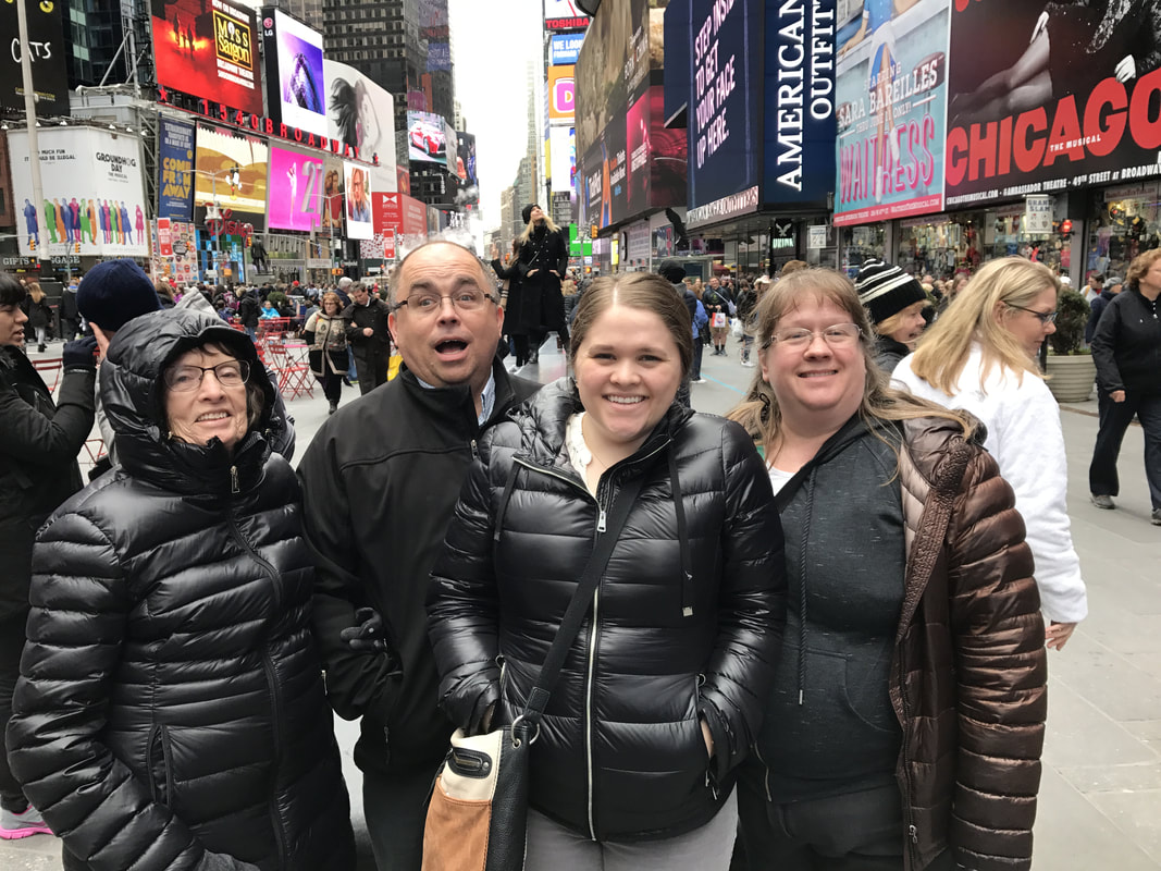
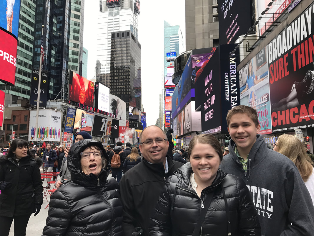
Original Photos Taken By Cathy Bell and Mark Bell
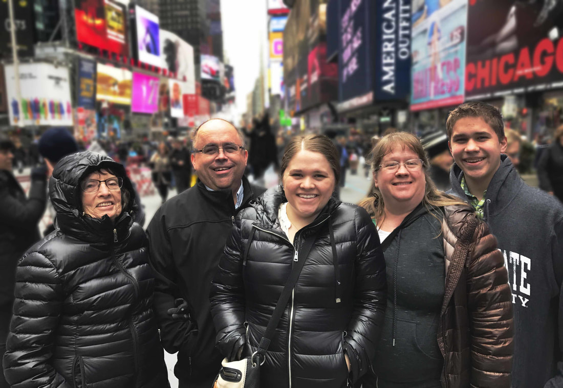
After Editing Using Photoshop
Photoshop Settings Used
-opened both the original photos and added them as layers in the same document
-used the rectangular marque tool to select the area around the dad's head and added the selection to a new layer
-turned off the layer where the dad was smiling and moved the selection layer over the dad's head where his mouth was opened.
-adjusted the opacity of the selection layer in order to transform the head and place it in the correct location
-added a mask and painted with black over the areas of the selection that did not need to be seen (all around the dad's head)
-used the rectangular marque tool to select the brother
-turned off the layer where the brother was present and moved the selection layer to the right of the mom
-used content aware scale to make the brother the correct height
-adjusted the opacity of the selection layer in order to place the brother in the correct location
-added a mask and painted with black over the areas of the selection that did not need to be seen
-added a curves layer to the entire document to fix the lighting in the dad's face and on the brother
-masked the curves layer and painted white over the dad's face and the brother
-cropped the image to make the brother appear as though he has legs since the original photo cut him off at the waist and to align the family with the rule of thirds
-used the quick selection tool to select the family on a new layer and added a mask
-added a blur on a new layer
-took the photo into camera raw to adjust the highlights and shadows, to reduce noise, to sharpen the photo, and to bring out the reds in the Times Square Background
-added another curves layer to adjust the overall lighting
Design Thoughts:
It's always difficult to get a photograph of your entire family while on a family vacation. I wanted to take these two images of my family in Times Square and combine them to make the perfect family vacation photograph. Both photos had a family member missing as well as a family member who was making a funny face. I chose the image with the best lighting and moved on from there. I wanted everyone looking at the camera, but the most important part was that everyone was in the image.
I also wanted the focus of the image to be the family. Yes, we were in times square, but all the business of the background was taking away from the family photo. A simple blur made the family the focus of the image, but you can still tell that they are in Times Square.
I didn't use brushes to touch up the faces of the family because I wanted the photo to appear natural and real. This was towards the end of the vacation, we were tired and cold, but we were still excited to be in times square. I didn't want to make it seem like a fake experience.
Credits:
Photo taken on an iPhone 7 by Cathy Bell.
It's always difficult to get a photograph of your entire family while on a family vacation. I wanted to take these two images of my family in Times Square and combine them to make the perfect family vacation photograph. Both photos had a family member missing as well as a family member who was making a funny face. I chose the image with the best lighting and moved on from there. I wanted everyone looking at the camera, but the most important part was that everyone was in the image.
I also wanted the focus of the image to be the family. Yes, we were in times square, but all the business of the background was taking away from the family photo. A simple blur made the family the focus of the image, but you can still tell that they are in Times Square.
I didn't use brushes to touch up the faces of the family because I wanted the photo to appear natural and real. This was towards the end of the vacation, we were tired and cold, but we were still excited to be in times square. I didn't want to make it seem like a fake experience.
- Contrast: After making the appropriate head swaps, I took the image into Camera Raw and brightened up the reds in order to make the reds in the background more contrasting. I also blurred the background in order to make the family pop out more.
- Repetition: There isn't much repetition added to this photo. Each family member was wearing a shade of black which incorporated repetition without any additional edits.
- Alignment: I cropped the image to bring the family to the front. Their heads align with the top line of the rule of thirds. The top boxes in the rule of thirds were left for the background of Times Square.
- Proximity: By cropping this image the family was brought closer to the front of the image. They are the first thing you notice when looking at this photo. The background of Times Square is smaller and clearly behind the family.
Credits:
Photo taken on an iPhone 7 by Cathy Bell.
