Design Thoughts:
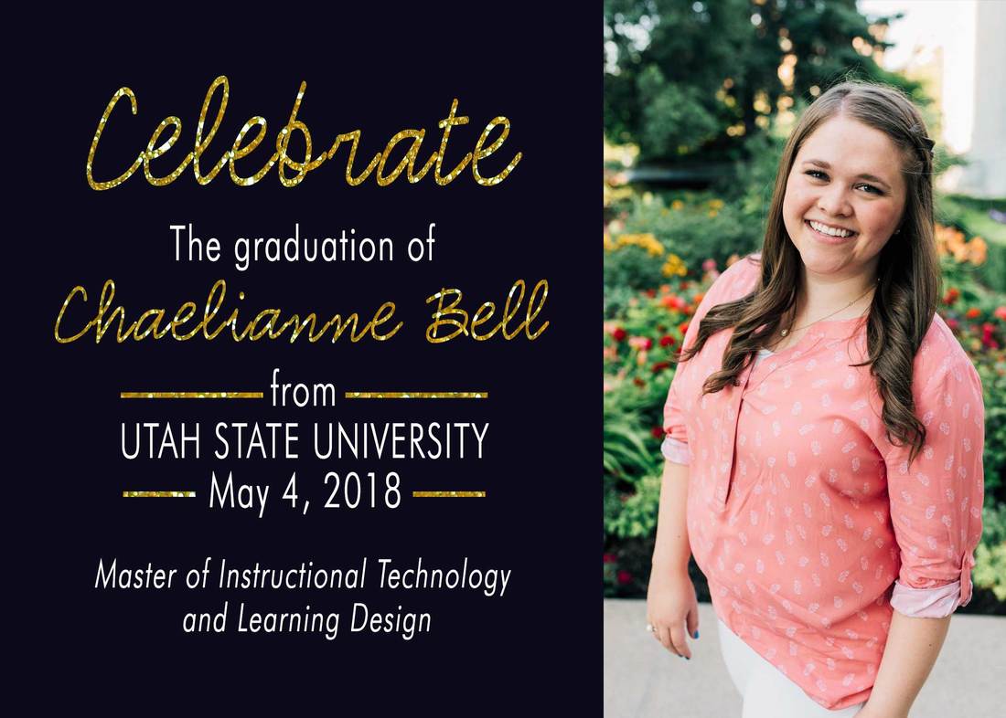
The main design elements I considered when designing this graduation announcement were contrast, repetition, alignment, proximity and the use of lines.
Contrast: I chose a dark navy blue back ground with contrasting white and gold lettering. Not only do the white and gold contrast the background, but they contrast each other as well. I chose to make certain words stand out more with the gold lettering. I also chose two very contrasting fonts, a scripty font, and a sans serif font.
Repetition: I repeated two fonts throughout this design, as well as font colors.
Alignment: I chose to use thirds to guide my alignments. The navy blue section takes up the majority of the design, with the portrait utilizing the rest of the space. All of the text is center aligned half an inch from the top and bottom of the design. The portrait is also aligned in a way that draws the viewers eyes to the text elements of the design.
Proximity: I utilized proximity with the placement of the different text elements. The elements that go together as one piece were place closer together while the other text elements were spaced further away from other elements.
Lines: I chose to use lines to show relationship within the text. The lines also draw the viewers eyes to the university and graduation date. The lines help this information hold its own among the gold scripty text.
Photoshop Settings Used
- Shape tool
- Text tool
- Transform tool
- Selection tools
- Clipping mask
- Grid lines
- Camera Raw for image editing
- hue and saturation
- highlights and shadows
- hue and saturation
Credits
Fonts:
-Futura Lt BT
https://www.wfonts.com/font/futura-lt-bt
-CK Script
http://www.fonts101.com/fonts/view/Uncategorized/44760/CK_Script
Images:
-Gold Sparkles
Pixabay
https://pixabay.com/en/gold-wrapping-paper-background-1075136/
Fonts:
-Futura Lt BT
https://www.wfonts.com/font/futura-lt-bt
-CK Script
http://www.fonts101.com/fonts/view/Uncategorized/44760/CK_Script
Images:
-Gold Sparkles
Pixabay
https://pixabay.com/en/gold-wrapping-paper-background-1075136/
