Photoshop Settings Used -Text -Text Transform -Drop Shadow -Shapes: paths
Design Thoughts:
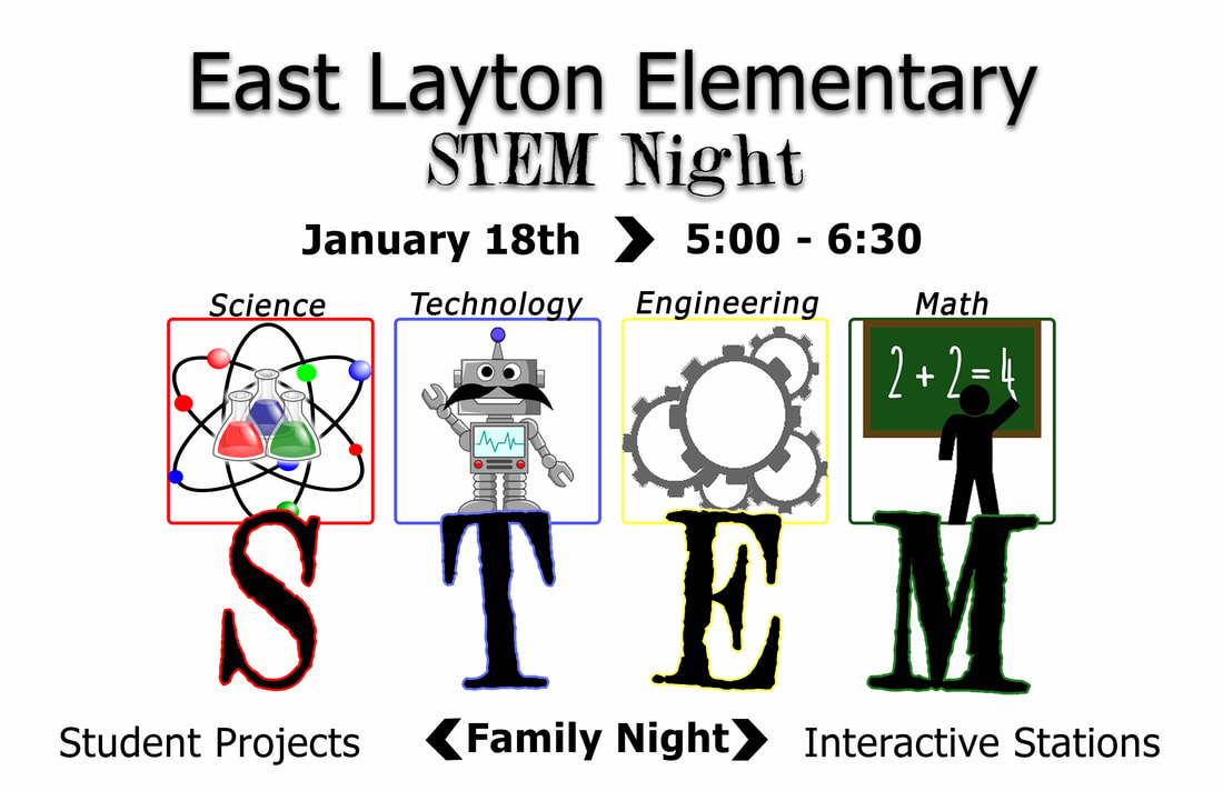
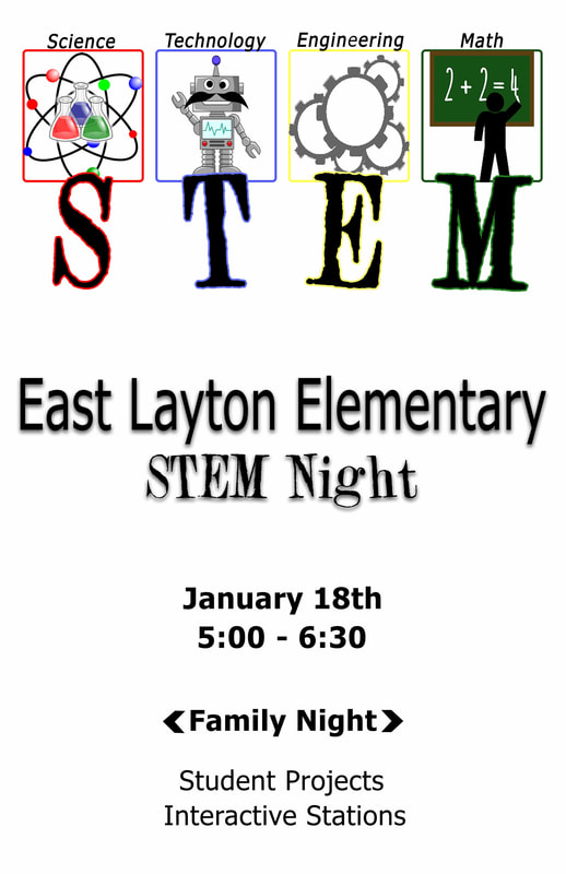
This flyer will be displayed throughout the elementary school that is hosting the STEM Night, as well as, sent home to families of students. I wanted the flyer to feature bright and primary colors since it is for an elementary. This elementary is making STEM a focus in the classroom, so I wanted STEM to be the focus of the flyer. Since it is for an elementary school, I also wanted it to appeal to elementary age children.
Contrast: The colors of the boxes and the drop shadows on STEM are contrasting colors. The serif font and the sanserif font contrast as well. The drop shadow on East Layton Elementary Stem Night, helps it contrast from the rest of the text.
Repetition: The colors presented in the flyer repeat themselves. The black text is repeated throughout the flyer and the colors of the boxes and the drop shadows on STEM repeat. The serif font used for STEM repeats in STEM night and the sanserif font repeats throughout the rest of the text.
Alignment: I used the rule of thirds to align the information on both flyers. The main focus (squares, graphics, and STEM) align with a rule of thirds line in each flyer with the rest of the information aligned appropriately around the main focus.
Proximity: I chose to overlap STEM with the square and graphics in order to show that each letter is represented by each square and graphic. Similar proximity was used for the words science, technology, engineering, and math. The proximity of the date and time were also show that they go together.
Credits: Fonts- Tahoma and 2Peas Evergreen Images- Google Images Stock