Design Thoughts:
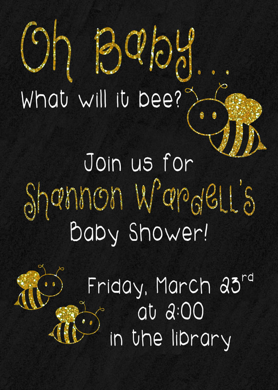
This was a quick design that I made for a friend's baby shower. It needed to be gender neutral and provide the necessary information. I used repetition, contrast, and alignment while creating this design.
Contrast: I chose a black background with white and gold contrasting lettering. The main focuses of the design are gold. I did this to help them stand out from the rest of the information. The two fonts I chose are also contrasting
Repetition I chose to repeat the fonts and colors throughout the design
Alignment: I chose to center align this design. The information at the top and bottom of the design are offset to the left and right, but the bee details create a centered look.
Photoshop Settings Used
- Patterns
- Text
- Layer Styles
- Masking
- Transform Tool
Credits
Fonts:
-2Peas Girly
http://fontsgeek.com/fonts/2Peas-Girly-2Peas-Girly
-2Peas Blueberry Pie
http://www.fontpalace.com/font-details/2Peas+Blueberry+Pie/
Bee Image
Homemade Preschool
http://www.homemade-preschool.com/bee-clipart.html
Fonts:
-2Peas Girly
http://fontsgeek.com/fonts/2Peas-Girly-2Peas-Girly
-2Peas Blueberry Pie
http://www.fontpalace.com/font-details/2Peas+Blueberry+Pie/
Bee Image
Homemade Preschool
http://www.homemade-preschool.com/bee-clipart.html
