Design Thoughts:
These infographics are part of a series designed for the skin care business Cyoa. I previously designed the logo, and used the same color scheme and design concepts to create these infographics. The intent of these infographics is to show the benefits of the oils used in each skin care line created by Cyoa. The main design elements used to create these infographics were repetition, message hierarchy, alignment, and color scheme/contrast.
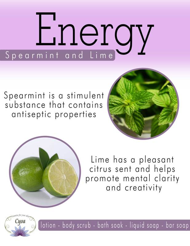
Repetition: The main use of repetition is through the color scheme. Purples and greens are repeated throughout the designs. The fonts are also repeated throughout the design to create unity within the message.
Message Hierarchy: The message hierarchy takes your eyes to from left to right and top to bottom with the least pertinent information found at the bottom of the design. The more pertinent information is larger in size than the less pertinent information
Alignment: I chose to use a balanced left and right alignment for these infographics. The most important information is centered at the top of the design, with the information about the oils used balanced on the left and right of the design.
Color Scheme/Contrast: I chose to use contrasting purple and greens in the main logo design and decided to stick with this same color scheme for the infographics. I used Adobe's color website to create a contrasting color scheme.
These infographics are part of a series designed for the skin care business Cyoa. I previously designed the logo, and used the same color scheme and design concepts to create these infographics. The intent of these infographics is to show the benefits of the oils used in each skin care line created by Cyoa. The main design elements used to create these infographics were repetition, message hierarchy, alignment, and color scheme/contrast.
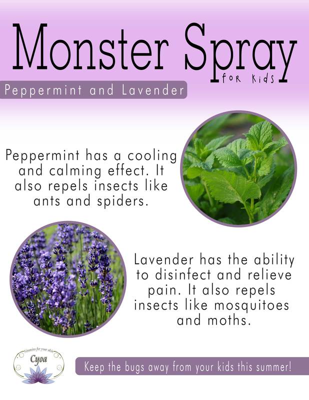
Repetition: The main use of repetition is through the color scheme. Purples and greens are repeated throughout the designs. The fonts are also repeated throughout the design to create unity within the message.
Message Hierarchy: The message hierarchy takes your eyes to from left to right and top to bottom with the least pertinent information found at the bottom of the design. The more pertinent information is larger in size than the less pertinent information
Alignment: I chose to use a balanced left and right alignment for these infographics. The most important information is centered at the top of the design, with the information about the oils used balanced on the left and right of the design.
Color Scheme/Contrast: I chose to use contrasting purple and greens in the main logo design and decided to stick with this same color scheme for the infographics. I used Adobe's color website to create a contrasting color scheme.
Photoshop Settings Used
- Shape tool
- Text tool
- Transform tool
- Selection tools
- Clipping mask
- Gaussian Blur filter
Credits
Fonts:
-Futura Lt BT
-GeoSlab703 Lt BT
-2Peas Chicken Shack Wide
Images:
-Spearmint
Pexels
https://static.pexels.com/photos/532169/pexels-photo-532169.jpeg
-Lime
Pixabay
https://pixabay.com/en/sliced-lime-fruit-lime-slice-667553/
-Peppermint
Pixabay
https://pixabay.com/en/melissa-pepermint-herb-plant-tea-1045727/
-Lavender
Public Domain Pictures
https://www.publicdomainpictures.net/view-image.php?image=14340&picture=lavender
