Design Thoughts:
The main design elements I considered when designing these posters were contrast, repetition, top down, and the alignment. This design is intended to be used as an advertisement for the Stokes Nature Center's 2018 summer camps which is a summer camp for youth.
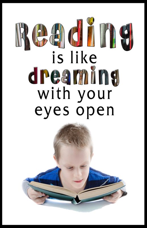
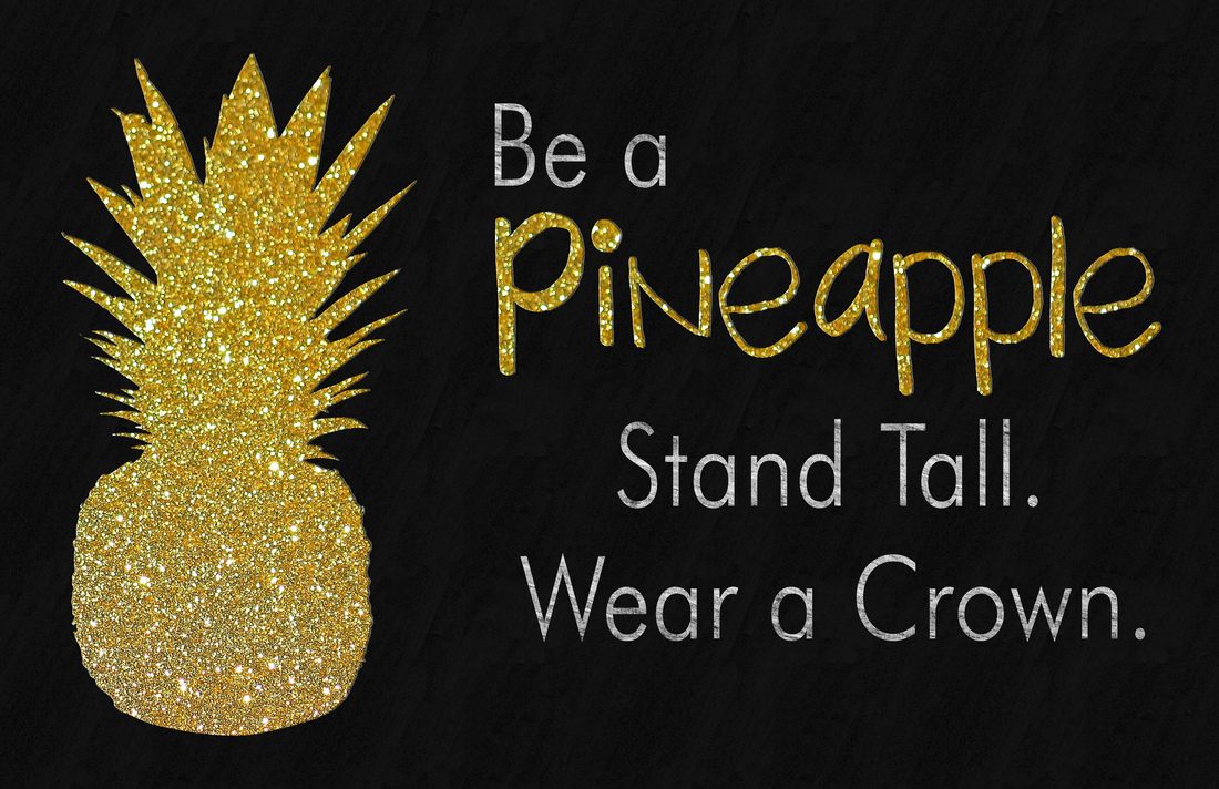
Repetition: Each poster focused on the use of two fonts repeated throughout the poster. In the reading poster, I repeated the book background on two of the words. On the pineapple poster, I repeated the gold background from the pineapple on the word 'pineapple.'
Contrast: On the reading poster, I chose a white background so that the text and the boy would contrast well with the background. The colorful books that fill the words 'reading' and 'dreaming' contrasts with the white background, as well as the black text.
On the pineapple poster I stuck with a black background with a slight chalkboard pattern. The contrasting gold and white stand out from the black background.
Top down: Both posters follow the top down eye pattern. The message grows as the reader moves their eyes from the top of the poster to the bottom.
Alignment: On both posters, I chose to split the canvas into a square section and a rectangle section. The quotes on both posters are aligned in the square sections with the images in the smaller rectangle section.
The main design elements I considered when designing these posters were contrast, repetition, top down, and the alignment. This design is intended to be used as an advertisement for the Stokes Nature Center's 2018 summer camps which is a summer camp for youth.
Repetition: Each poster focused on the use of two fonts repeated throughout the poster. In the reading poster, I repeated the book background on two of the words. On the pineapple poster, I repeated the gold background from the pineapple on the word 'pineapple.'
Contrast: On the reading poster, I chose a white background so that the text and the boy would contrast well with the background. The colorful books that fill the words 'reading' and 'dreaming' contrasts with the white background, as well as the black text.
On the pineapple poster I stuck with a black background with a slight chalkboard pattern. The contrasting gold and white stand out from the black background.
Top down: Both posters follow the top down eye pattern. The message grows as the reader moves their eyes from the top of the poster to the bottom.
Alignment: On both posters, I chose to split the canvas into a square section and a rectangle section. The quotes on both posters are aligned in the square sections with the images in the smaller rectangle section.
Photoshop Settings Used
- Magic Wand and Quick Selection
- Clipping Mask
- Text
- Layer Styles
- Layer Blending Modes
- Transform Tool
- Fill Tool
- Pattern Tool
Credits
Reading Poster
Fonts:
-Friz Quadrata ITC T
-Cheri
Image:
-Pixabay
Pineapple Poster
Fonts:
-2Peas Wonderful
-Futura Lt BT
Gold Background:
-Pixabay
https://pixabay.com/en/gold-wrapping-paper-background-1075136/
Reading Poster
Fonts:
-Friz Quadrata ITC T
-Cheri
Image:
-Pixabay
Pineapple Poster
Fonts:
-2Peas Wonderful
-Futura Lt BT
Gold Background:
-Pixabay
https://pixabay.com/en/gold-wrapping-paper-background-1075136/
